Dear TF2 fandom, regardless of what social media site you are using. Please do not repost art without an artists permission, artists should not be required to put giant watermarks on their work just because you failed to see if they were okay with you reposting their work.
I wanna add onto this by saying, there are many profiles especially on Instagram that post a lot if not only tf2 content WITHOUT CREDITING THE ARTIST.
I have seen many accounts and all of them write -art not mine / video not mine / fanfiction not mine- and thats just NOT GOOD ENOUGH? I have actually spoken up to these accounts in several occasions, sending them requests to credit the original creators EVEN EXPLAINING HOW TO TRACE BACK THE CREATORS and all they do is pull the “you’re attacking me” card and cuss me out????? I’m a fan content creator of tf2 myself and the fact that a lot of people like myself get disrespected and their stuff stolen for these “fan” accounts and hubs to enjoy is disgusting and we should all stand up to it..
Thank you for the OP of this post because I was starting to feel like the only person asides from the original content creators who cared about this…
Reblogging again, cause it’s still relevant! People still upload other people’s work. When interacting you get blocked and when they notice which upload got reported, they upload it again saying QUOTE: “because someone was immature and reported it for literally no reason 😒”
If you see your artwork or any of your friends there! Let them know and report it a violation of my copyright! Instagram will take it down in around a day or less!
This is true. I post TF2 art on IG, and more then once my art was reposted and NOT credited or linked. I’ve noticed this is very common with TF2 IG users who are younger, but either way, it’s not hard to link certain artists. But this is also the reason why artists should put their signatures. Cause they can post “artist unknown”/“Art not mine” all they want…but at least my name will still be there.
this is probably gonna be a bit long so just a heads up i guess?? also please note im not a student for anything in art and am not a professional i’m just giving out my opinions on this and things based on my own experience.
do thumbnailing
you don’t always have to start it with the actual frame and the drawing for thumbnailing doesn’t have to be good. this is just to let you have a feel of what you want for the final frame. it also doesn’t have to be digital you can just doodle it in some paper you found lying about. this is also good for parts of your animatics where there’s lots of movement(like dancing!)
thumbnailing is also good for parts where you have multiple ideas! doodle all your possible ideas and see which one is best for that scene
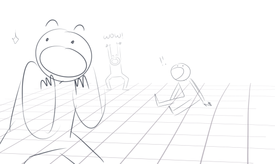
perspective/angled shots
these are super cool and can help with the atmosphere of the scene! for example:
they also just look really nice and interesting and fun
landscapes and backgrounds
you can’t always have just a bunch of people gathered around all in one frame, you gotta show the setting of the whole thing
this also allows for your characters to move around more! don’t always make them flat like this though(this doesn’t mean you can’t do this, just don’t do it all the time)
grab a ruler or if you don’t have one like me, zoom out completely and try to make straight lines(they don’t rlly have to be perfectly straight though! but don’t make them too slanted either)
and if you have sai, free deform it and set the perspective to 100% and then just mess around with it!
also remember to add buildings/furniture/etc if needed!!
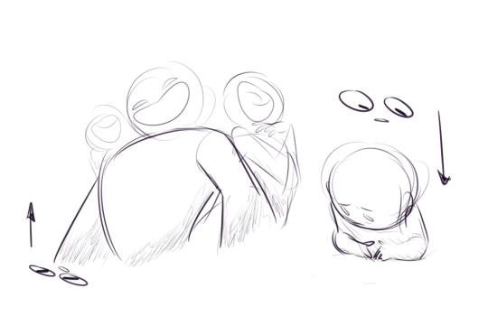
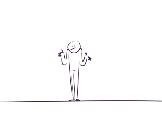
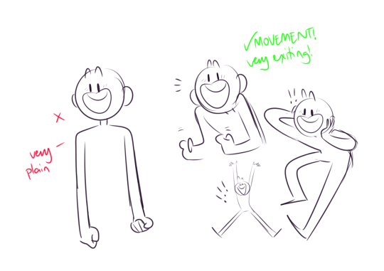
do dynamic poses
these help the facial expressions of the character! a lot of people seem to just concentrate on just the face for emotion but body language is also important!
you can throw in some perspective into this as well!
make a LOT of frames
as mentioned above, movement is very exciting!! and you can show movement with those frames. it doesn’t even have to be a lot of movement like one second they were there and now they’re in an entirely different spot, subtle movement is also very good!
try not to reuse the same frame too much! it might end up looking very awkward
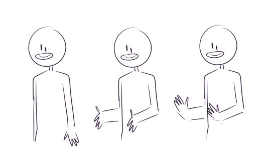
also try not to just erase and add things to the body of a character as if it were some kind of paper doll stuck to a wall like this:
it’ll end up looking very stiff and awkward. instead, just redraw the character completely! make them move around a bit
you don’t always have to make things super clean
you don’t have to do clean lineart, just doodle a frame and make it easy to read for everyone on what’s happening. especially because drawing hundreds of frames is already so time consuming and not to mention stressful. do yourself a favor and not tire yourself out more than you should.
that’s kind of all the pointers i have. hope this helps!!!
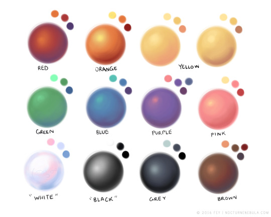
Drawing basic facial expressions is not the hardest. Most people can draw a sad face, a happy face, angry etc., but making more multidimensional expressions is more of a challenge. I have gotten a lot of compliments on how I draw facial expressions, (specifically “angsty ones”) telling me that they are very dramatic and well… expressive! And there are actually only a few things I think about when I draw faces that take them to the next level, so I thought i’d illustrate them all here!
SUPER IMPORTANT TIP BEFORE WE START: Look at your own face when you draw faces. Even making the face when you are drawing (you don’t even have to look at it), will give you some sense of how the face muscles pull and where things fold and stretch, because you can feel it. You are the best reference when it comes to facial expressions!
Angles
Draw the head in an angle that matches the expressions you want to make. It is not a requirement, but is going to add to the effect.
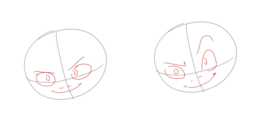
Symmetry vs asymmetry
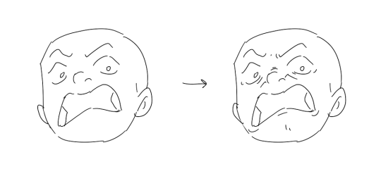
A face is rarely symmetric. Unless the face the character is making is 100 % relaxed or even dissociating, the eyebrows, mouth and facial muscles will have different placements of their respective side. This image shows the dramatic impact asymmetry has on a face:
That’s the difference between a smile and a smirk!
The first one’s like “oh yeah?” and the second is like “oH YEAH??”
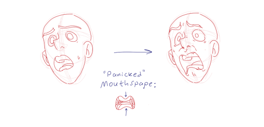
The “balloon squishing principle”
This is something I did subconsciously, and I didn’t know about until I made this tutorial. And this principle goes hand in hand with an asymmetric face. Basically, if you squish one part of the face, you need to even out the empty space by “inflating” the other part of the face so that it doesn’t appear shrunken. The picture hopefully explains it:
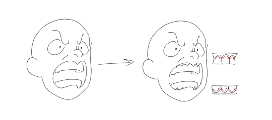
Teeth
Don’t forget to add the gum when the mouth is open to its full potential!
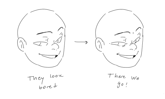
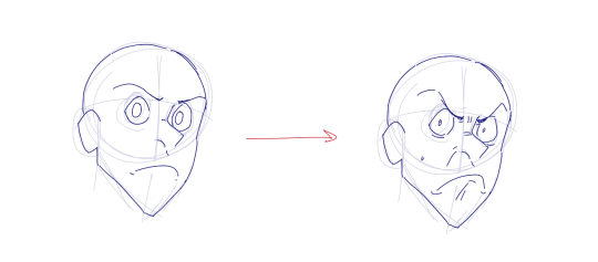
Squinting and folding
Adding folds around the eyes when a character is squinting makes a HUGE difference. It makes a smile more genuine and a growl more intimidating. Adding folds to the face in general makes your characters more lifelike and ‘visually relatable’. Like, they look human, and less plastic or fake.
and so on..
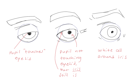
Pupils and irises
The placement of the iris and pupil in relation to the eyelids is very important! The less of the white you see, the more relaxed the character is.
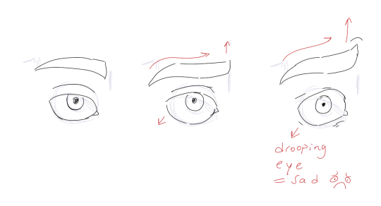
And then of course eyebrows and eyes go hand in hand!
Gestures, spitting, sweating…
Adding more elements than just a face is key to making the character actually look like they are feeling what you want them to feel. Just the tiniest sweat drop adds to their anxiety, spitting adds frustration to their rage, slouching shoulders, waving hands, a double chin, extreme angles, the list goes on! Add whatever and see what kind of impact it makes! Does it do the trick? Great! Add it!
Over exaggeration!!
Remember that you can almost always exaggerate more. Don’t be afraid to do draw “too much” because you’re just experimenting. See what works and what doesn’t. What do you like to exaggerate?
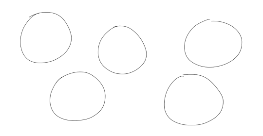
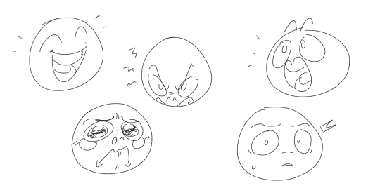
Now that you know some theory, it’s time to practice!
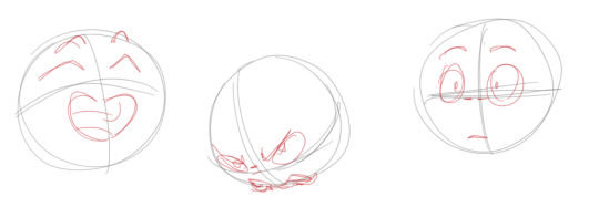
Fill a page with circles and fill them in with different expressions. Try and exaggerate as much as you can!
This is mostly for experimenting. They are quicker to draw than complete faces, but the same rules should apply!
And that’s about it!
I don’t know if I covered everything in this tutorial, since some things might be obvious for me, and this post perhaps only scratches the surface. So feel free to send me a message if you want an explanation about something more in depth! Thank you for reading! And now DRAW!!! ✨🎨