Citizen is simpler and more beautiful~ but just in case anyone needs this.
DUDE BUT THIS IS WHAT I’VE BEEN TRYING TO TELL PEOPLE
in medieval times you ONLY addressed a king/queen with “Your Majesty”, NEVER “Your Highness”. To address a king/queen with “Your Highness” was considered an insult.
Hello graphic makers!! You’re probably aware that there is a huge problem on tumblr with whitewashing. As a predominantly disney-based blogger, the whitewashing I personally see are from the disney fandom, so I’m going to use screencaps from those movies to show you several quick techniques so you’ll see just how easy it is to have your pretty bright and pastel colour palettes and not whitewash characters of colour.
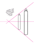
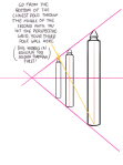
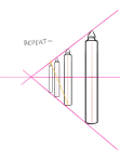
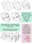
When it comes to creating characters, sometimes it’s easy to let them slip into the same old stock standard set of body types. Basically clones with a few props, hairdos and make up to spice things up a bit. After a while, having the same actor play dress up for every character gets kinda boring…
It’s tough to break the habit too, especially when you’re taught a single set way to draw. Not to say having a solid construction method is ever a bad thing, as long as it doesn’t confine your creativity.
Check out these nifty tips and pointers by jeinu to give each of your comic book characters their own a unique flavour of memorable originality.
This is important, and something I super need to improve on. All these tips and stuff for drawing are crazy useful and very, very appreciated.
THIS TUTORIAL WAS ALREADY AMAZING THEN I SAW MEDIC WAS ONE OF THE EASILY DISTINGUISHED SILHOUETTES AND I SORT OF DIED A LITTLE ON THE INSIDE BECAUSE YOU KNOW MEDIC AND AAHHH I HAVE A SERIOUS PROBLEM
i’ve had a couple screwdrivers and i want to talk about colors for a sec. so, a tip from your mom.
the tip: don’t use black and white for your shading and highlighting.
(pls forgive the quick doodle for the purpose of an example) one of these is clearly softer and more vibrant. it can play up your palette choices, even if they’re not that exciting by themselves- but pink or brown shading makes everything look really nice.
how bout this one?
black and white values for your art won’t completely ruin it. but there’s way more you can be doing with it. low opacity black to shade an art piece is a lil bit boring. it doesn’t make any of your colors stand out, it doesn’t take much creativity on your part. won’t stretch the muscles.
HOWEVER, that doesn’t mean you shouldn’t ever use black as shading. but to work it at its best, you have to actually use black. the purpose?
contrast! it’s great for drama. black shading is used for sharp graphic styles- you’ve seen it in a lot of comics before. it commands attention for a serious situation. imo, black should be used as its full self, or not at all. low opacity black just looks gross and boring. it’s way more fun to use other colors, i promise!


