HELLOO i’m so sorry i somehow let this ask rust in my inbox omg i hope
you’re still around for me to offer some help LOL and hopefully this can
prove useful to some other people too! ^_^
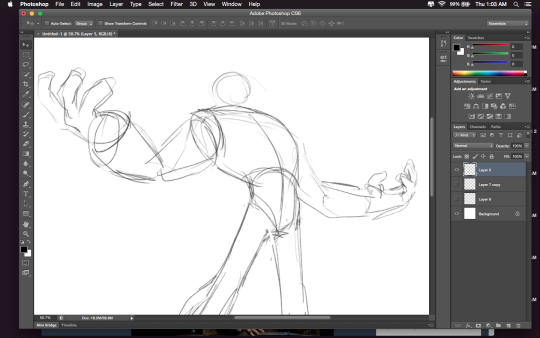
For those wondering about HOW to do this, here’s a short explanation according to me:
Drawing A to Drawing B: -the most obvious change is the exaggeration of the line of motion in the character.
In Drawing B the line of motion is much more pronounced, creating more drama and movement to the whole composition
-The arms are open wider, showing more confidence and exuberance in the character, exaggerating their emotions so they can be more clearly read without having to look to the face for emotional cues.
-the legs are wider apart, adding to the aforementioned confidence but also giving the character a solid foundation, visually speaking.
-The head is tilted back and overlapped by the chest, adding a touch of dynamic perspective to the drawing.
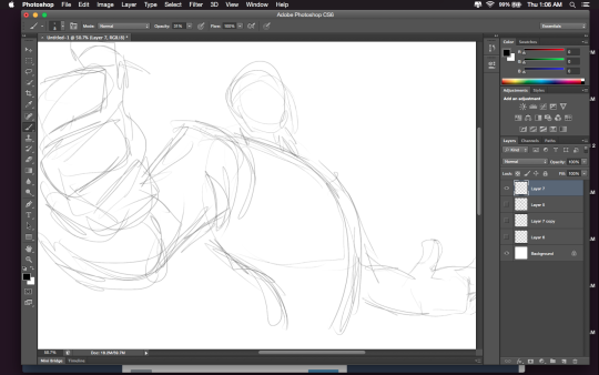
Drawing B to Drawing C: -Most obvious change is to zoom in on the character. Character framing is just as important as what the character is doing. Zooming in can help infensify emotions. this shot is ALL about this character and what they’re feeling. -Because of the zooming in, the arms/hands would have gotten lost, so instead of making the canvas wider, the artist has elected to rotate the character slightly, bringing a dynamic angle to things and more intensity to the close shot. -While the character is more upright in this shot compared to Drawing B, in Drawing C the chest still slightly overlaps the neck, preserving the feeling of being slightly below the character (putting them in a position of power relative to the viewer), which helps maintain confidence and power in the character. -the chest is exaggerated to carry the majority of the body’s line of action so even though you cannot see the legs, our brains are able to fill in the gap and envision that line of action. -The cropping/framing of the character allows for a more interesting composition/negative shapes created by the positive (character) on the negative (background), creating more visual interest as well as a circular motion to the composition through the arms, across the face to the negative space for the eyes to rest in before dropping to the hand in the background and back through the composition again.
Pretty sure I’ve posted this before. But worth a repost
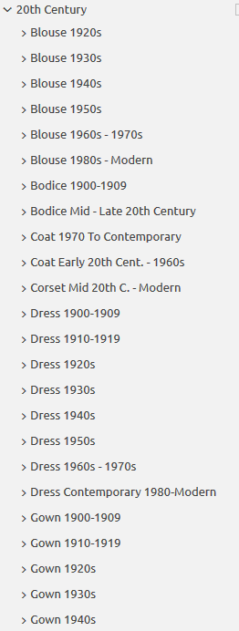
Do you design a lot of characters living in not-modern eras and you’re tired of combing through google for the perfect outfit references? Well I got good news for you kiddo, this website has you covered! Originally @modmad made a post about it, but her link stopped working and I managed to fix it, so here’s a new post. Basically, this is a costume rental website for plays and stage shows and what not, they have outfits for several different decades from medieval to the 1980s. LOOK AT THIS SELECTION:
OPEN ANY CATEGORY AND OH LORDY–
There’s a lot of really specific stuff in here, I design a lot of 1930s characters for my ask blog and with more chapters on the way for the game it belongs to I’m gonna be designing more, and this website is going to be an invaluable reference. I hope this can be useful to my other fellow artists as well! 🙂
Well, not specifically. There’s no special trick to it. You have to hone your powers of observation and just practice drawing clothes. With TF2, you at least have the advantage of being able to read design notes from the team at Valve to see what they were thinking and look at reams of concept art. Another thing you can try is looking at the artists that influenced the look of the thing you’re studying, so instead of just looking at TF2 art, also get a feel for classic American illustrators J.C. Leyendecker, Dean Cornwell, and Norman Rockwell.
Just looking at the line-up of the mercs, I could boil down their aesthetic to “streamlined cartoony mid-20th-century, relying on strong silhouettes and absurd stereotypes to instantly communicate each character’s function.” That right there gives you a few places to start.
Don’t try to design anything from the top-down until you have a really good understanding of your fundamentals. Instead, start from the bottom-up and build on what you know about the setting and your character’s needs. That way, things will fall into place much more naturally.
Apparently concentrated Kool-Aid can be used as a pretty effective leather dye.
I was making a drink while cutting the snaps off some new straps for my pauldrons and I got curious, so I tried it, thinking, “ok even if this works, it will just wash out.”
Nope.
It took the “dye” (undiluted) in about 3 seconds. After drying for about an hour and a half, it would not wash off in the hottest tap-water. It would not wash out after soaking for 30 minutes. It did not wash out until I BOILED it, and even then, only by a tiny bit and it gave it a weathered look that was kind of cool. Add some waterproofing and I’d wager it would survive even that.
That rich red is only one application too. Plus it smells great, lol.
So there you go, cheap, fruity smelling leather dye in all the colors Kool-Aid has to offer.
WELL THEN!
this may be important to some of my followers *and certainly not just getting reblogged because of my costuming and my boyfriends desire for leather armor*
When I was in middle school we used to use it to dye our hair. Potent stuff.
If you’re dying anything with kool-aid it’s best to use SUGAR-FREE ones otherwise the thing you’re dying might get all sticky
the flavor only packets where you are supposed add sugar are the best. they will dye any natural fiber: leather, wool, cotton, hair, flax, jute, silk and so forth. heat the dye water so it is more potent. let dry then rinse excess out in cold water. there’s a whole system to this.
Oh my god
This will prove very useful for any future cosplays I wanna do.
For those wondering about HOW to do this, here’s a short explanation according to me:
Drawing A to Drawing B: -the most obvious change is the exaggeration of the line of motion in the character.
In Drawing B the line of motion is much more pronounced, creating more drama and movement to the whole composition
-The arms are open wider, showing more confidence and exuberance in the character, exaggerating their emotions so they can be more clearly read without having to look to the face for emotional cues.
-the legs are wider apart, adding to the aforementioned confidence but also giving the character a solid foundation, visually speaking.
-The head is tilted back and overlapped by the chest, adding a touch of dynamic perspective to the drawing.
Drawing B to Drawing C: -Most obvious change is to zoom in on the character. Character framing is just as important as what the character is doing. Zooming in can help infensify emotions. this shot is ALL about this character and what they’re feeling. -Because of the zooming in, the arms/hands would have gotten lost, so instead of making the canvas wider, the artist has elected to rotate the character slightly, bringing a dynamic angle to things and more intensity to the close shot. -While the character is more upright in this shot compared to Drawing B, in Drawing C the chest still slightly overlaps the neck, preserving the feeling of being slightly below the character (putting them in a position of power relative to the viewer), which helps maintain confidence and power in the character. -the chest is exaggerated to carry the majority of the body’s line of action so even though you cannot see the legs, our brains are able to fill in the gap and envision that line of action. -The cropping/framing of the character allows for a more interesting composition/negative shapes created by the positive (character) on the negative (background), creating more visual interest as well as a circular motion to the composition through the arms, across the face to the negative space for the eyes to rest in before dropping to the hand in the background and back through the composition again.