I feel like TF2 really established great standard for character design and silhouette even though all the characters are super stylised they still look like real people, every detail feels unique even all their ears are different.
This kind of attention to detail seems pretty underappreciated outside of the fanbase in general.
Plus the amount of personality and expression that comes out of these characters is very self evident in all of the meet the shorts
my two favourites still being Meet the Demoman and Meet the Engineer
Just thought this would be a useful bit of information for young artists when it comes to overall character design, especially when designing a whole cast of unique characters.
DON’T EVEN GET ME STARTED ON HOW BRILLIANT TF2 IS IN TERMS OF DESIGN. It is one of the best examples to show someone when teaching them about character design.
Like yeah…not only do they have unique noses, jaws, ears even…valve even took the extra step to give them each distinct teeth.
My character design teacher has brought up TF2, and the concept art by Moby Francke, a few times in class. For one Moby Francke was highly inspired by the great artist J.C. Lyendecker.
And many of the key components in designing the character is gesture, shape and silhouette, and just getting in great key components that create story telling.
This is one of the reasons I love TF2 so much because it makes me just…art fangasm all over it.
oh wow thanks anon! i had time for this actually so i gave it a go!! this is bad and vague i’m sorry. maybe one day i’ll make a proper tutorial thing….. when i actually understand……. how i draw heads and faces??? tbh anon i don’t understand how i do it
yo here’s a useful tip from your fellow art ho cynellis… use google sketchup to create a model of the room/building/town you’re trying to draw… then take a screenshot & use it as a reference! It’s simple & fun!
Sketchup is incredibly helpful. I can’t recommend it enough.
There’s a 3D model warehouse where you can download all kinds of stuff so you don’t have to build everything from scratch.
reblog to save a life
This is an incomplete tutorial, and it drives me crazy every
time I see it come around.
We live in a pretty great digital age and we have access to
a ton of amazing tools that artists in past generations couldn’t even dream of,
but a lot of people look at a cool trick and only learn half of the process of
using it.
Here’s the missing part of this tutorial:
How do you populate your backgrounds?
Well, here’s the answer:
If the focus is the environment, you must show a person in relation to
that environment.
The examples above are great because they show how to use the
software itself, but each one just kind of “plops” the character in front of
their finished product with no regard of the person’s relation to their
environment.
How do you fix this?
Well, here’s the simplest solution:
This is a popular trick used by professional storyboard and
comic artists alike when they’re quickly planning compositions. It’s simple and
it requires you to do some planning before you sit down to crank out that
polished, final version of your work, but it will be the difference between a background
and an environment.
Even if your draftsmanship isn’t that great (like mine),
people can be more immersed in the story you tell if you just make it feel like
there is a world that exists completely separate from the one in which they
currently reside – not just making a backdrop the characters stand in front of.
Your creations live in a unique world, and it is as much a character as
any other member of the cast. Make it as believable as they are.
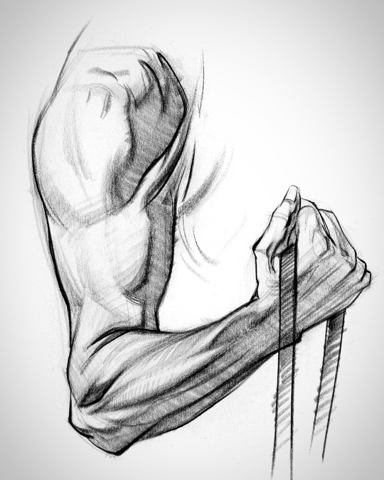
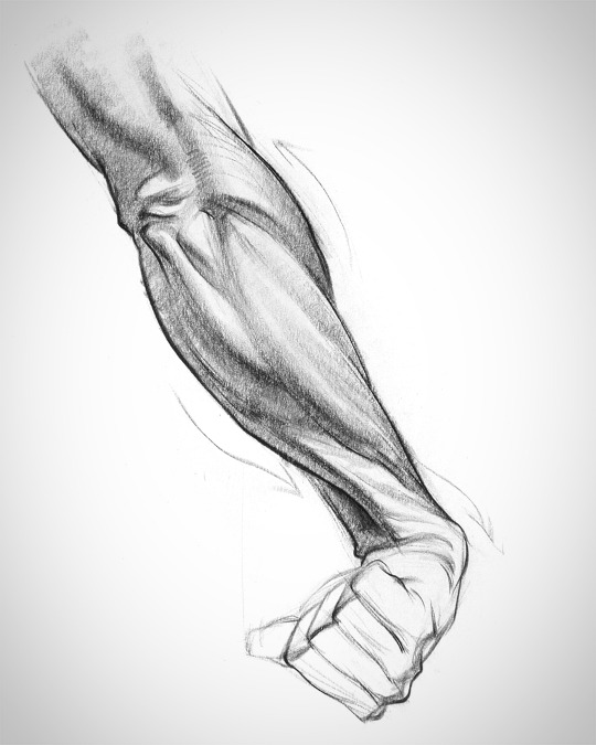
There’s three main groups: the flexors and extensors each take one half of the forearm, and the ridge muscles sit on top like a little tiara. Each group has it’s own unique form. Learning their anatomy will help you design awesomely dynamic arms.
Let’s try to make forearms manageable to draw. This is a body part most artists don’t quite understand. It can be real intimidating if you don’t know the muscles.
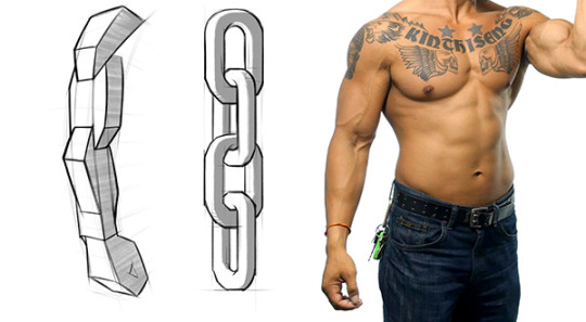
The arm has a simple chain design and the forms interlock down the arm.
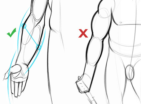
To avoid the snowman effect, use straight, angular lines and look for asymmetries. Compare the apex of both sides of the forearm to understand the curvature better. Notice that the flexors reach lower on the wrist than the extensors and ridge muscles.
Look for this kind of thing when you’re drawing the gesture of the muscle groups. A wave rhythm where the curve on one side leads into the next curve on the other side.
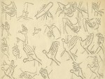
scribbled down a quick sanity check of the two giant women in the TF2 comics to make sure I wasn’t just drawing the same thing twice.
They’re not spectacularly differently proportioned, not showing off any skills in character/silhouette design here but I thought it might be interesting…
i saw a post asking about how to not make heavy, soldier and engie sameface and it annoyed me so here. i may not be most qualified for this but I think if you spend time looking at the characters enough you can easily find differences.
the most important thing is to keep in mind the overall face shape as well as the spacing between the features. if you are having trouble and find they look the same then go look at pictures of em for awhile and draw from them and it should really help.


